New Font Easier to Read

A new typeface – greater legibility and readability for low vision readers

Would you like to make things easier to read? There is a new typeface, designed to be more legible, available for free.

Screenshot 2021-07-06 165652.png

Atkinson Hyperlegible font is named after Braille Institute founder, J. Robert Atkinson.  What makes it different from traditional typography design is that it focuses on letterform distinction to increase character recognition, ultimately improving readability.  The Braille institute is making this free for anyone to use!

This is designed for people with low vision, but it will make it easier for everyone. Check out this link.

Winner of Fast Company’s 2019
Innovation By Design Award.

Is your child struggling because of vision problems? A checklist.

Do you have concerns about your child's eyes, vision, or learning? This checklist will help with your observations. 

Banner photos - newsletter.png

Look out for these signs
□ Red or watery eyes
□ Red or crusted eyelids
□ Frequent styes on lids
□ One eye that turns in or out at times

Does your child complain of
□ Headaches with reading or writing
□ Burning or itchy eyes
□ Print blurs or double vision
□ Words move or “swim” on the page

When reading does your child
□ Hold their book close to their eyes
□ Lose place often or needs a finger to
   keep place
□ Re-read or skip lines or words
□ Confuse similar words
□ Have a short attention span

When writing does your child
□ Have untidy writing
□ Use their hand or finger to space writing
□ Repeat letters within words
□ Skip letters, numbers or words
□ Reverse letters, words or numbers
□ Squint, close or covers one eye
□ Tilt their head
□ Have their face close to desk / screen

Other problems
□ Must feel / touch things to understand
□ Often confuses right and left sides
□ Difficulty with similarities & differences
□ Blinks, squints, rubs eyes often

If your child is showing any of these signs, or you have other concerns about your child's vision or eyes, book a Behavioural Vision Assessment with Sally Adams.  

(Please bring this checklist with you to the appointment to help Sally with her assessment.) 
 

Book an Appointment Online

or call us on 09 425 9646

What we are wearing - Diane in Face a Face

image_6487327 (2).JPG

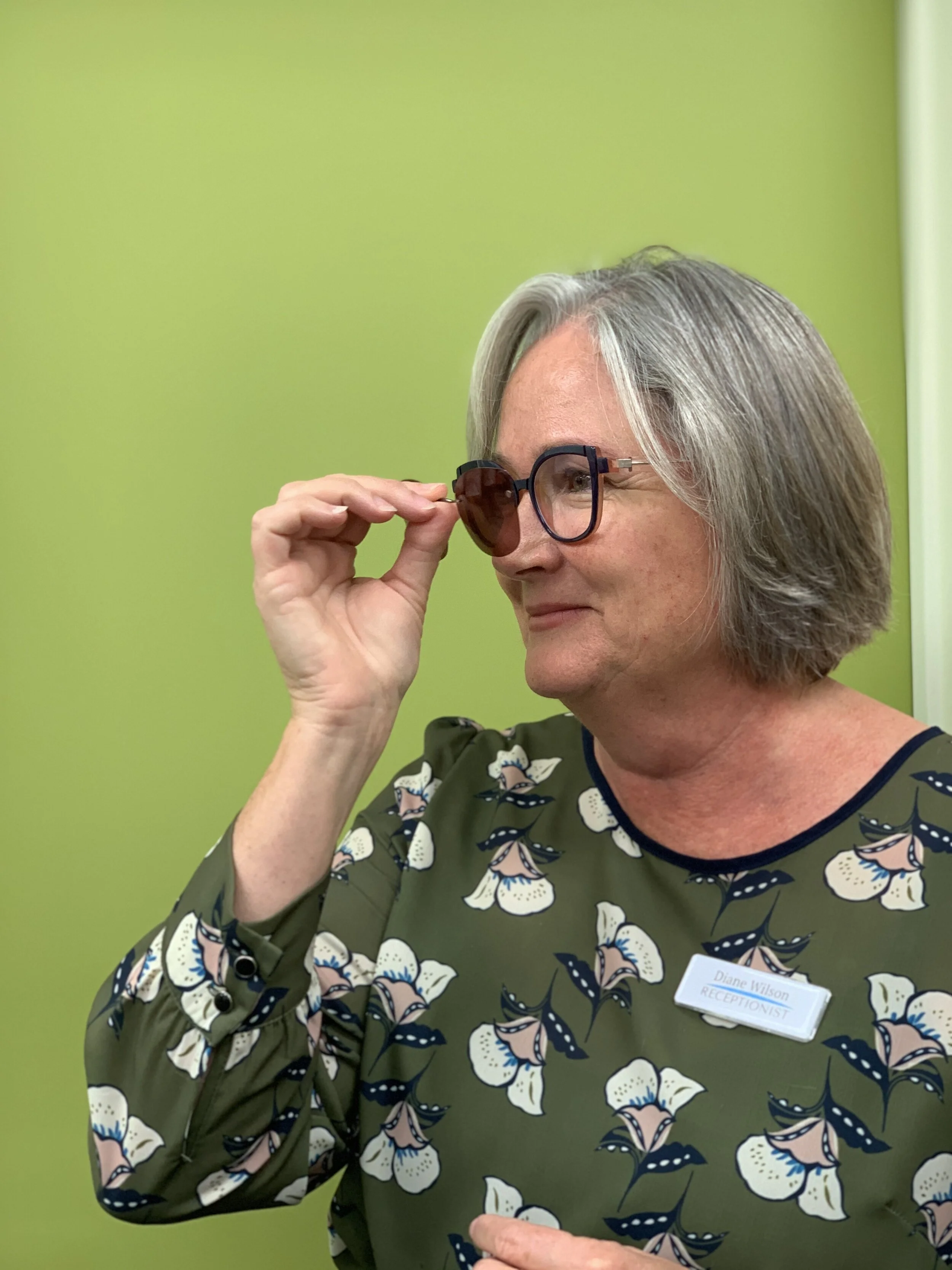
Diane is wearing a stunning Face a Face frame, a bold acetate. The frame name, Mikado, is very apt for the facetted detailing. This is a departure from her recent frame choices - just what she wants, a change.

Frame: Face a Face Mikado colour 1502KN 35 eye

Lens: Hoya Mystyle Profile Modern progressive, 1.53 Phoenix, Clear lens a Diamond Finish anti-reflection coating.

Acetate (plastic) frame is a change from nosepads for you, how are you finding it?

Diane: The fit of the bridge just works in these ones.

How do you find the vision?

image_6487327 (1).JPG

Diane: It is the same progressive design I have had previously, but this pair is so clear. A deeper and larger frame has given me better vision.

You have chosen a Chem Clip with this pair - how do you like it?

I got the rose tint which I like. The clip in it’s case it very compact and I like that it releases space in my bag if I am not carrying my prescription sunglasses with me.

With all your glasses you must have a special storage system?

Absolutely! All safely away in their cases in a drawer. Mostly in the original case but I have been known to swap cases too.

Eyelash serum information

Untitled design.png

A recent item on NZ TV program Seven Sharp highlighted potential side effect of using eyelash serums.

These over the counter products have been developed using prostglandins, a medicine used in glaucoma treatment. One of the side effects of using prostaglandin eye drops is eyelashes grow longer, stronger and darker. So serums have evolved to be applied to the lashes only.

However it good to read the fine print as there can be other side effects associated with long term prostaglandin use. These include darkening of skins and pigmentation around the eyes, and eye can become more deep set.

For more information see the following Consumer information.

What we are wearing - Holly's newest glasses

Holly is working through her Optical Dispensing course, and taking the opportunity to experience optics first hand trying different lenses.

Lens: Hoya Sync III 5, 1.50 index material with Sensity Grey and Diamond Finish Anti-reflection Coating

Frame: Lightech 30200L colour NP09 matt black/gold 52 eye

What do you like about these glasses?

Holly: This is my first pair of glasses with nosepads, and I’m surprised how comfortable they are. They are light, and I am enjoying the different look with a metal frame.

The sync lenses have a boost in power at the bottom of the lens. What difference are your noticing?

Holly: Assembling glasses in the workshop is pretty detailed, that extra boost is helpful. I don’t notice a difference compared to my other lenses, which are one prescription over the entire lens - these are just as clear and comfortable for distance vision. The combination of the Sensity tint plus the diamond finish gives me good glare control for screen work - which I am doing more of with my course.

These Sensity lenses go dark in the sun, how do you find this?

Holly: Good for outdoors.